
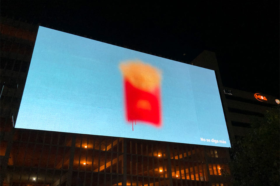
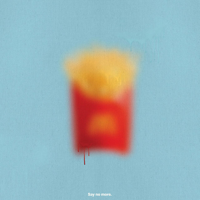
Not because of censorship. Apparently, McDonald’s in Puerto Rico wants to prove how recognizable the brand is in the country (or something along that line). With the help of Puerto Rico-based creative agency TBWA\San Juan, McDonald’s rolled out a series of ads that is sure to make you rub your eyes, double take on what have just saw or check your glasses. Why? Because all these ads, with the exception of the single color background, each features a blurred out image of a particular highly recognizable product from the American fast food chain.

Anyone who is familiar with the brand will be able to tell that it was a Big Mac, a Happy Meal or a McFries against bright color background on the billboard or on social media. Each advertisement is consummated with a short phrase in Spanish that says “no se diva más” which translates to “say no more.” The aim is to prove that McDonald’s products are as recognizable even without a clear image and without the presence of the iconic Golden Arches.

I have mixed feeling about this particular ad campaign. On one hand, I think it is a brilliant concept, but on the other, I find it to be an eyesore. Sorry. I just can’t help it. I am kind of OCD about sharpness of images and the out-of-focus ads can be quite annoying. Just saying… in case you are wondering how a person with an obsession with sharpness is able to put up with the less-than-sharp feature image on the post here… well, it is the theme’s doing. I lack of the technical knowledge to prevent the theme from resizing the good resolution image to 640 pixel and then enlarging it again, which consequently, results in the slightly blurred image.


Images: TBWA\San Juan.
Source: designboom.

